
Creating a Scorecard
This section is devoted in showing you how to build a quick scorecard as well as it will give you a hint as to how you should interpret the results. We will not use the best variables that we created in the previous sections, because we need to take into account that some people might have skipped some parts of the tutorial. You can do it so yourself later on once you get the grasp of it and email to me how better the results were with those variables! Therefore we will use the ones that the set has already inside unaltered, namely TYPE, REGION, INSURANCE, SEASON, DISEASE, INSTITUTION.
Something I need to mention beforehand is that the relationships of the variables with the target might not be validated when running a scorecard (that uses regression). For example we found that older people have a higher tendency to churn, this however might not be reflected in the produced score that may have attributed a relatively low value (generally speaking). Why? This is because of the covariance matrix. It is important to understand why this occurs and be able to explain it to stake holders who most of the times do not like this miss-match and think you have done it wrong! Regression algorithms check the correlation of all variables when assigning scores and try to capture only new information regarding them. For example, we saw earlier that people who have cancer tend to churn a lot. Now, if these people also tend to be older, the algorithm does not feel the need to use the latter variable in the same way. On the contrary if there are some older people, that do not have cancer and tend not to churn, you might even see a negative (or low score) for the older people.
- Go to the Scorecard tab in the menu bar and press “Produce Scorecard”
 .
. - In the left column you need to select the Target Variable or type Target in the first text field from the top.
- In the second (middle) column you need to select the predictor variables TYPE, REGION, INSURANCE, SEASON, DISEASE and INSTITUTION. Alternatively you can type in the second text field TYPE,REGION,INSURANCE,SEASON,DISEASE,INSTITUTION.
- If you created a partition variable at the end of the previous tutorial, you can select it in the third (right) column or type its name in the third (from the top) text field. If you did not create a partition variable, do not worry, just change the value of the fourth text field from 0 to 2 and kazAnova will create one for you! People who selected a partition variable must not change this value.
- In the box that says “Linear”, select “Logistic” so as to use Logistic regression that tends to give better results in these kind of problems.
- Leave Everything else as is and press “Confirm”.
If you don’t select a partition or change the value to 2, kazAnova will use all the set to create the scores. In this case it would not be a bad idea as the set is small, but for the sake of doing things as you would normally do, I would like you to do it with a proper split.
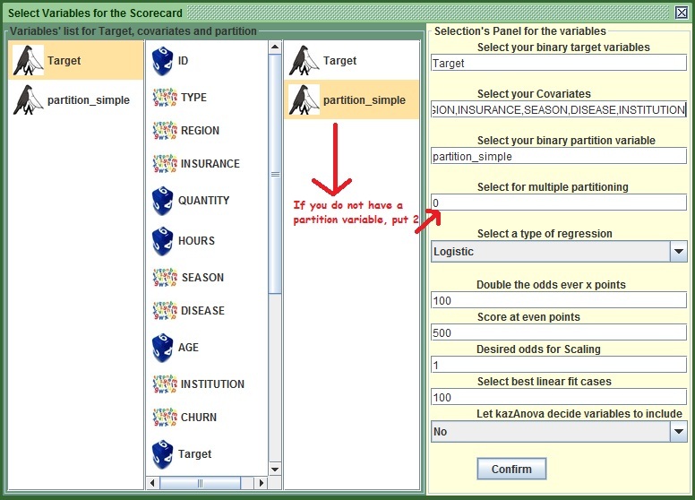
Image: KazAnova's Scorecard Tab
Essentially the scorecard is computed and all you need to do now is interpret the results. View the following figure to get a broad idea of the role of the different sections:
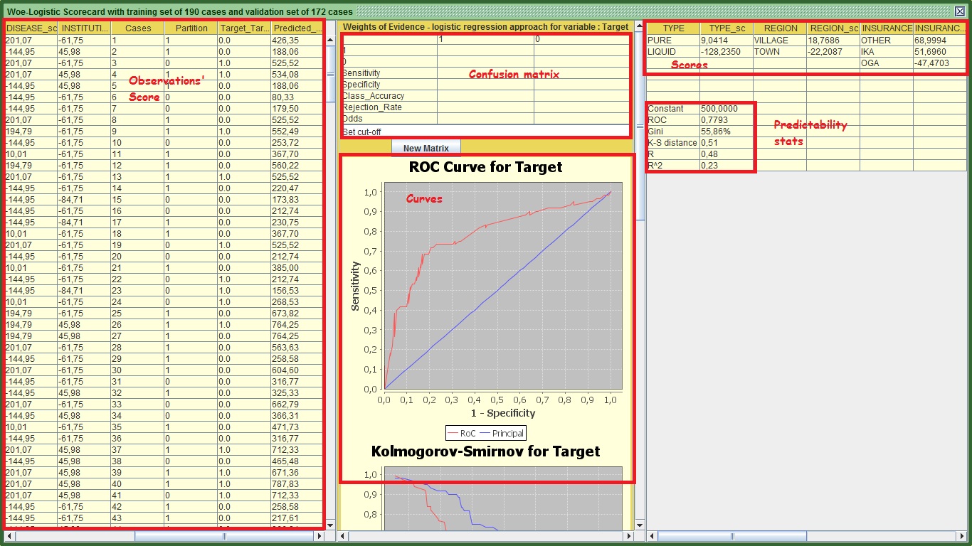
Image: KazAnova's Scorecard Output
Let’s start from the right panel. This panel contains the actual scorecard and the predictability statistics that show how good the model is in regards to the validation set only. You can export that by selecting all the table holding down the left click of your mouse and pressing ctrl + c . Then go to an excel spreadsheet or notepad or anything that accepts letters and press ctrl + v or just paste. You will definitely get different scores as we have different partitions. The predicted score for each observation is computed as follows:
Score = Constant+TYPE+REGION+INSURANCE+SEASON+DISEASE+INSTITUTION.
The constant in my case is 500 (it sits on top of the predictability statistics). You can see the rest of my scores that have been formatted a little bit in an excel spreadsheet:
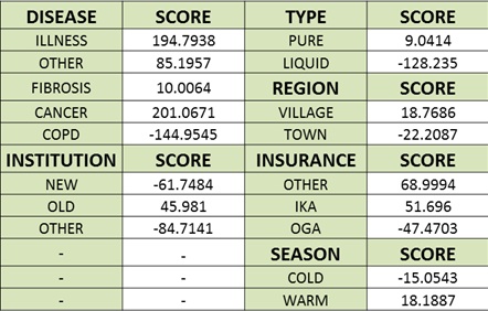
Image:Actual Scorecard
Now, If I know a person named Mr. X that subscribed in the company and previously had Cancer, came from the OLD institution, took PURE medicine, came from a VILLAGE, had IKA and signed up in a COLD period then the score will be:
X Score =500 + TYPE=PURE (9.0414) + REGION=VILLAGE (18.7686) + INSURANCE=IKA (51.696) + SEASON=COLD (-15.0543) + DISEASE=CANCER (201.0671) + INSTITUTION=OLD (45.981) .
More simply:
X Score = 500 + 9.0414 + 18.7686 + 51.696 -15.0543 + 201.0671 + 45.981 = 811.5 approximately.
Generally the higher the score, the higher the propensity to churn (and the target to have a value of 1). From the range of scores in each variable, you can understand that in the DISEASE variable, someone might get as low as -144 points (COPD) and as high as +201 (CANCER). You will not see this kind of range in the other variables, validating that this one is the most predictive input. If you recall this variable by itself had a Gini of 48%. Now that we put all the variables together, we managed to raise that Gini to 56% (in my case) for the validation set. You are familiar with the rest of the stats displayed here, namely the area under ROC, R and R square. The only thing that you are unfamiliar with is K-S that is the maximum distance based on the Kolmogorov-Smirnov curve. Again, do not panic, one thing at a time.
For now lets us move on to the first panel to the left (leave the middle for now). What kazAnova does here is exactly what I did before when I was computing the score for Mr. X (stay with me and I will reveal his true identity in the future!). It takes each row of our set (regardless of whether it was in the validation or training set) and scores them one by one in the same order as they appear in the main set. The last column in that panel called “predicted_value” is the score attributed to each one of the subscribers.
So far we have understood how good the model is in terms of statistics and how to assign a score to a potential subscriber, what we have not clarified yet is what the score means in terms of churners and not churners. Is a score of 800 high enough to say that “ I will not accept this person, because it has very high chance to churn”?
Let’s move our focus to the middle panel. The first graph that you see is the RoC or Gini curve same as we have viewed before for the variables individually. The only difference is that this one takes into account all the variables and it is for the validation set only. In my case the curve has some strange sharp ups and downs because the validation population is relatively small and nonlinearities exist in the score in comparison to how the target moves (e.g. is not always the higher the score…the higher the propensity to churn in a linear relationship).
The second graph shows the Kolmogorov-Smirnov curve. Imagine that we sort all the subscribers that were in the validation set from the smallest (left) to the largest (right) based on the predicted score. The blue line (forget what the labels say under the graph, they do funny things sometimes), shows the proportion of the total churners (those that have a value of 1) that have a score higher than the displayed one. This percentage is also called Sensitivity. Similarly the red line shows the proportion of the total non-churners (those that have a value of 0) that have a score higher than the displayed one. This percentage is also called one minus Specificity. In my case, where the green line is, at the score of 522 approximately, is the maximum distance between the two proportions (e.g. the biggest value after subtracting them).
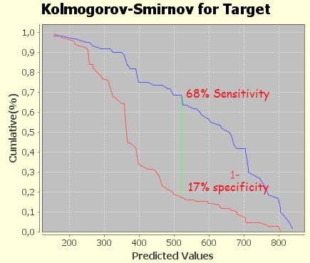
Image:Kolmogorov-Smirnov Curve
Let’s attempt to comprehend that point in more detail.
- Go to the confusion matrix tab and put your maximum distance score approximately as you see it from the K-S chart.
- Press “New Matrix”
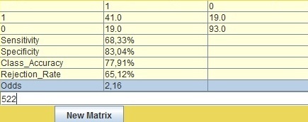
Image:Confusion matrix
You will definately have different but similar results. The way you interpret the results based on the above matrix is as follows:
If I say that based on my 172 cases (you van seet it on green header of the main window) of my validation set I will reject all people that have a score higher than 522 then:
- I will reject 60 people in total (41 + 19, the right upper one). Of those 60, 68.3% or 41 truly churned. The rest 19 (or 31.7%) did not churn. In other words the churned versus non-churn or just Odds ratio is 2.16 (41/19) for that cut-off.
- Similarly from the total of 112 (19 left lower one + 93) people that scored less than 522, 93 or 83.04% truly did not churn. The rest 19 (16.96%) churned.
You can clearly see that there is an obvious discrimination of churned people scoring higher than those who did not churn.
The difficult part in deciding a cut-off is that most of the times you don’t know how much a good customer values over a bad one. For example if you knew that for every bad customer who gives a certain loss, at least 2 good are needed (that will stay more than 30 days) to make up for that loss (looking for odds higher than 2), then you wouldn’t mind losing a few goods so as to accept only those with very low scores and very low propensity to be bad customers (e.g. to churn). In many cases you build also a “value of a customer” model to predict how much cash you are expected to earn and you combine those 2 models to make a decision.
The last chart shows how much people you need to reject in order to achieve certain odds of churners versus non –churners.
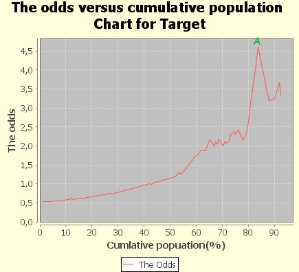
Image: Odds versus Cumulative population
See the point A in my chart. This tells me that if I accept approximately 85% of the population with the lowest score and reject only the 15% with the highest score, the ones that would have truly churned are 4.5 times more than those who would have not churned.
That is all about the Scorecard’s interpretation. Genereally you can right click and press copy to export any chart you want to and software that accepts images. It is a good time to export the scores as they appear in the very left panel.
- Scroll down the middle panel until you see the button “Export”.
- Press “Export”.
- Put the name scores.txt (you have to add .txt).
- Press save.
- Make certain that the file is created.
- Close the scorecard window.
- Go back to your main set and go to Pre-process and press Manipulate
 .
. - Press the button “Attach” seventh from the top.
- In the frame that opens, find the scores.txt file you saved just a moment ago and press open.
- From the left column in the new frame (that contains all the columns that were in left panel of the scorecard) select “Predicted_Value” and Partition if you don’t have it already in your set (e.g. if you replaced 0 with 2 in the beginning of this tutorial and did not put your own partition variable).
- Press Confirm.
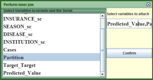
Image:The Attach window
You will now see that the predicted scores can be found at the end of the main kazAnova window on the right. As said earlier, the scoring calculations always apply to the whole set in the exact same order it was prior to creating the scorecard. Rest assured that the scores are correctly attributed to each case with the attach method that just "pastes" columns on the right of the table.
In order to visualize the Gini of the Whole set, not only the validation as we did before:
- Go to the Pre-process tab in the menu bar and press Gini
 .
. - On the left of the two columns, select Predicted_Value or type Predicted_Value in the first text field from the top and on the right column select Target or type Target in the second text from the top.
- Press Generate.
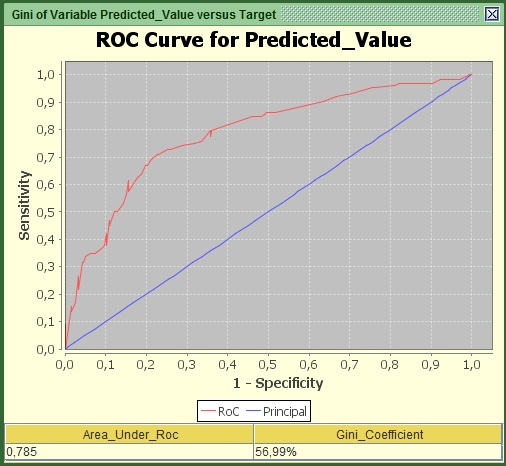
Image:Gini and RoC of teh whole set.
In my case the Gini of the Whole set (with the validation included) is around 57%, higher than the validation set. That means the performance is better in the training set which makes sense as it was the one that created the scoring mechanism.
A good way to view the propensity levels across the score band is to create 5 segments of equal proportions.
- Go to the Pre-process tab in the menu bar and press bin
 .
. - On the only available column, select Predicted_Value or Type Predicted_Value in the second text field from the top.
- Change the name of the potential new variable in the first text field from the top to Predicted_Value_5_Equal from Predicted_Value _derived.
- Leave the second text field from the top to 5.
- Press the second button from the top “Equalized_Population”.
- save
- Go to the Graphs tab in the menu bar and press Bar
 .
. - On the left of the two columns, select Predicted_Value_5_Equal or type Predicted_Value_5_Equal in the first text field from the top and on the right. column select Target or type Target in the second text from the top.
- Press confirm.
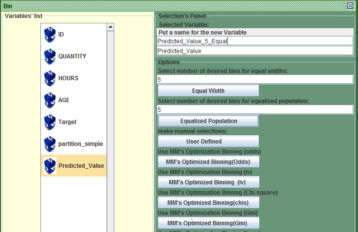
Image:Bin with equalized population

Image:Equal population score bands versus Target
In my case, you can clearly see that people in the last 2 bars, have much higher propensities to churn. The company may choose to accept only those in the first score band with the lowest score. Again that depends on how we value a good over a bad customer that needs to be given as a number (e.g. 2 goods every 1 bad).
We made some very good progress; you may call yourself proudly a junior credit scorer (if it is the first time you have ever done a scorecard). That is the end of tutorial 4, the next one is focused on building a decision tree. No much time will be spent on the interpretation of the output because it looks a lot like this one. I will only highlight the differences. You may proudly proceed to tutorial 5.