Knowing the variables
What we haven’t done so far is setting an ultimate goal for this analysis - What we are trying to model and therefore to predict? One of the most important things in any scorecard development is to know the variables that you use well and be absolutely certain about how they are derived and if there is any bias associated with them. In any case, you might need to explain to stake holders (if any) what are the variables you used and why the results look in a specific way.
Let’s set the background.
Assume that there is a small company that sells medical therapies to people in a subscription fashion. That is you pay every month in order to undertake those therapies. The company has realized that there is a cost associated with setting up a new customer account as they need to register with specific insurance funds in order to get the payments going plus extra costs for consumables and many more such expenses. The company’s expert accountant has realized that if the customer does not retain the subscription for more than 30 days, then it is not profitable to have them as the costs outweigh the income. The company hires YOU (yes you behind the computer!) to build a model that will predict which customer is more likely NOT to retain the subscription for more than 30 days in order to send them to competitors (please ignore the fact that might not be morally correct because this is just an example). The Company gives you the file I have already given you that contains historical data of the past 3 months with the following explanations about the Variables:
- TYPE: Type of therapy in either liquid form or pure (pills).
- REGION: Whether the customer comes from Town or Village
- INSURANCE: Type of insurance fund the customer has (IKA,OGA,OTHER)
- QUANTITY: How much substance the customer was using.
- HOURS: How much time they needed to use the therapy per day
- SEASON: When was the period they came to the company (Cold or Warm).
- DISEASE: The reason for the visit.
- AGE: The Age of the customer at the day they subscribed.
- INSTITUTION: In which hospital the customers were prior to subscribing.
The Company provided all those details along with a marker that shows whether the customer left (with the value of 1) or not (0) after the first 30 days. This Variable is called Target. Actually you might see a variable that is called “CHURN” that it is exactly the same with the difference that instead of 1 and 0 we have YES and NO. However kazAnova understands only numeric target variables therefore you may ignore this one.
Now we have one set of defined variables with some definitions but we know nothing statistically interesting about them. Lets start by viewing some descriptives:
- Go to the Pre-process tab in the menu bar and press Descriptives
 .
. - Select AGE (You will notice that only variables with a “numeric” classification appear) or alternatively type AGE (case sensitive) in the text field on the right.
- Press confirm and see the general descriptive statistics of the AGE.
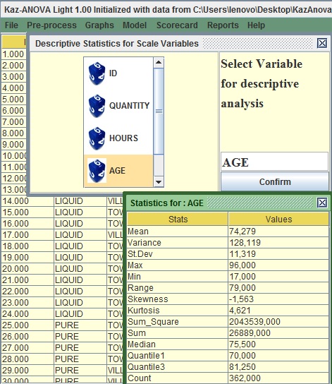
Image:Descriptives of AGE
The mean of Age is around 74 years old, therefore older people tend to subscribe. What is also interesting is that there is a big range of values as the youngest person subscribed in these 3 months was 17 years old.
In order to visualize the variable:
- Go to the Graphs tab in the menu bar and press Histogram
 .
. - On the left of the two columns, select AGE or Type AGE in the first text field from the top
- Leave the number of bins to 10 and Press confirm.
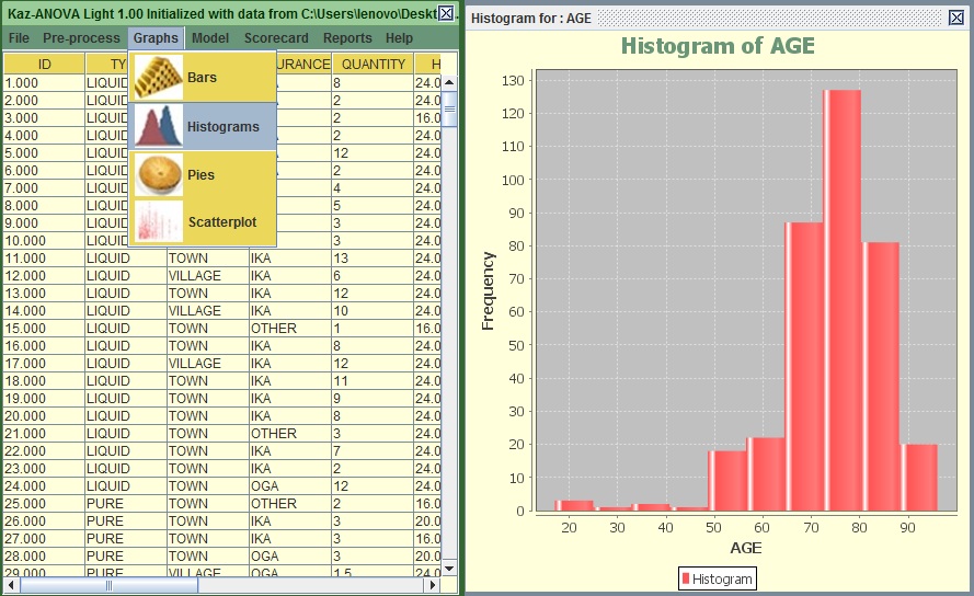
Image:Histogram of AGE
You can see that most subscribers are between 65 to 85 years old. This is interesting to know but it does not really help us to build a logic regarding the tendency of a subscriber to stay less than 30 days.
Again:
- Go to the Graphs tab in the menu bar and press Histogram.
- On the left of the two columns, select AGE or type AGE in the first text field from the top and on the right column select Target or type Target in the second text from the top.
- Leave the number of bins to 10 and Press confirm.
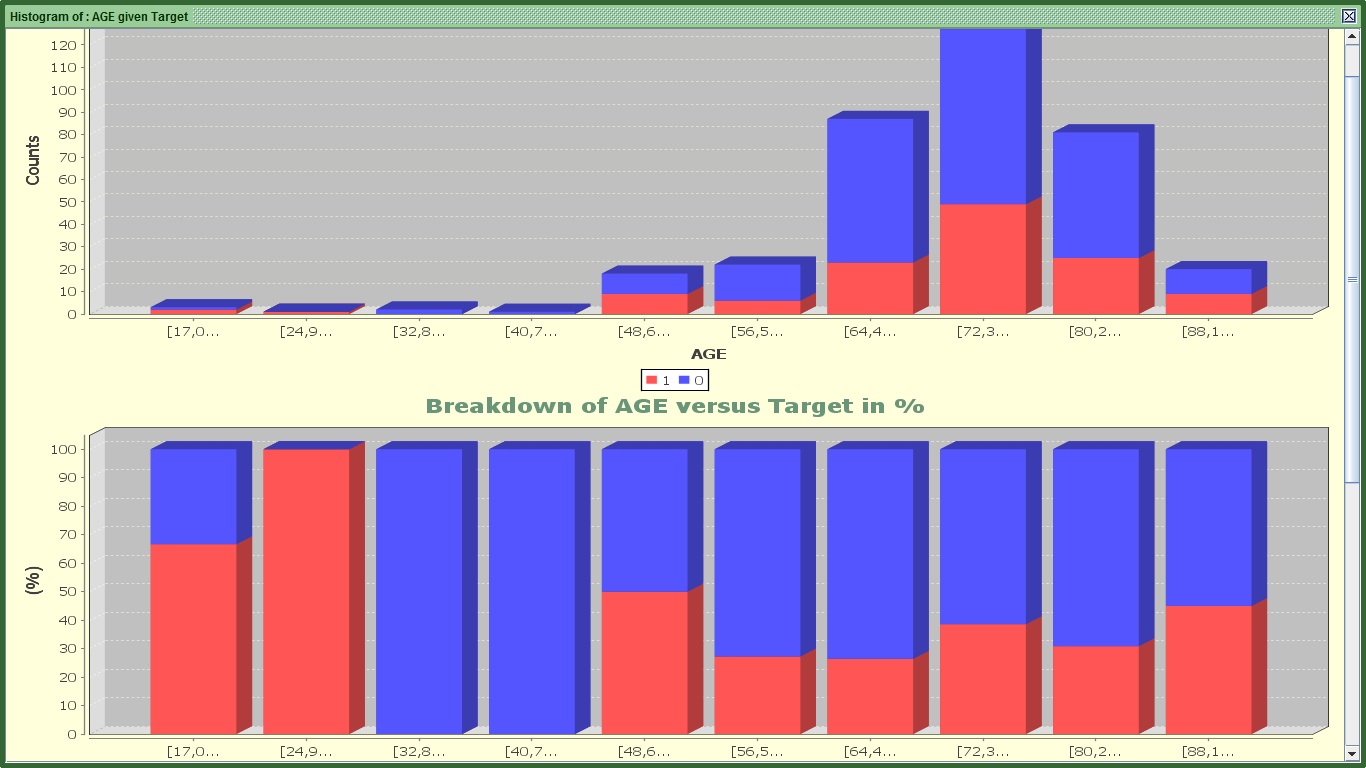
Image:2 of 3 graphs for AGE's Histogram
You can see 3 graphs.
The first one splits the AGE by 10 equal bins in terms of range (every 8 years approximately). The red color shows those that stopped before completing a month. Still it is difficult to see in which groups there is higher tendency to stop within that period. That is why we need the second graph.
The second one shows for the same ranges with the first graph how many are 1 or 0 proportionally. For example in the first group (17-24.9) there are 2 churners (that have the value of 1) and one that did not stop (and has the value of 0). The second graph displays 66.6% churners (or 2/3) and 33.3% for non-churners (1/3) for the same group. With this graph we can understand that there are group of subscribers that have higher tendency to stop such as ages from 17-33, 48-56, 88 or more. However in the younger categories there are not many people so as to make the results very significant.
Ignore the third graph. It attempts to separate AGE in bins of equal population, but it does not work well with integers or variables with a few distinct values.
Ok, What if my variable is not numeric and I want to visualize it in terms of churners and non-churners. In that case:
- Go to the Graphs tab in the menu bar and press Bar
 .
. - On the left of the two columns, select DISEASE or type DISEASE in the first text field from the top and on the right column select Target or type Target in the second text from the top.
- Press confirm.
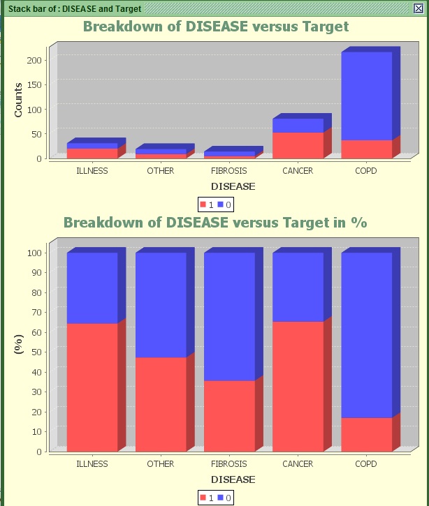
Image: Stack bar of AGE versus Target
Most people tend to subscribe after being diagnosed with the COPD Disease. And they appear to have less than 20% chance of stopping within 30 days. On the other hand people diagnosed with illness or Cancer possess much higher chance to churn (more than 65%).
The DISEASE variable appears to be more predictive than the groups of Age we saw before if we take the population into account.
How do we measure predictiveness anyway?
There are various statistics to measure the relationship of one (binary) variable with another. I will prompt you to search the Wikipedia or generally the web to find more details about how to compute them, but for this tutorial you do not really need to know. However most of them work for categorical variables only.
Categorical variables might be numeric or alphabetic but they need its values to be seen as categories. For example AGE is not categorical because it has too many values. It would be wrong to interpret each different age (like 22, 23, 24, 25 and so on) as different category. On the other hand a variable that has one group that contains all ages from 18-25, another with 26-40 and one more with 41+ is a categorical variable. For the purposes of this tutorial, all string variables DISEASE, TOWN, REGION, SEASON, INSTITUTION and INSURANCE are categorical variables. AGE, HOURS and QUANTITY are not.
Going back to the main predictability statistics available in KazAnova, those are:
- Information Value or IV: The higher it is, the stronger the relationship.
- I-Gain (Information Gain and Entropy): The higher it is, the stronger the relationship.
- Chi-Square: The higher the statistic is (or the lowest its p value), the stronger the relationship.
- Gini Coefficient and Area under the Roc Curve: The higher the absolute value is, the stronger the relationship.
- R and R square: The higher the absolute value is, the stronger the relationship.
There are a few more (such as T-tests and ANOVA) mostly used in pure statistics, but the above should be more than enough to give you a good idea of how predictive each variable is. It is high time we check some Ginis.
- Go to the Preprocess tab in the menu bar and press Gini
 .
. - On the left of the two columns, select DISEASE or type DISEASE in the first text field from the top and on the right column select Target or type Target in the second text fieldfrom the top.
- Press Generate.
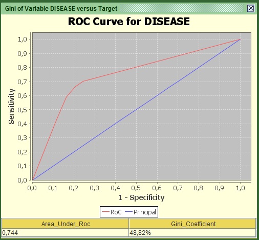
Image: Roc Curve of AGE versus Target
You should be able to see a graph and two values under it. What you need to know and report is these 2 values (Area under RoC and the Gini coefficient) and the curve itself. Both statistics refer to how much this variable explains regarding the relationship with the target. In the curve, the area that lays between the red and the blue line shows how much is explained and the area from the red line to the upper left edge shows how much is still unexplained regarding the logic behind being churner or non-churner. From experience any value of Gini above 10% for individual predictors is to be considered. Here the value is more than 48% so it is a very strong predictor. For those that are more advanced, the curve is derived by converting the variable into numeric via the weights of Evidence transformation.
Now try the same with another variable:
- Go to the Preprocess tab in the menu bar and press Gini.
- On the left of the two columns, select REGION ortype REGION in the first text field from the top and on the right column select Target or type Target in the second text field from the top.
- Press Generate.
You can see that the figures are smaller here. The difference is quite significant so that we can say with confidence and no hesitation that this variable is not as predictive as the previous in helping us deciding which people will stop within 30 days.
The Information value is one of my favorite ones:
- Go to the Preprocess tab in the menu bar and press Information Value
 .
. - On the left of the two columns, select INSURANCE or type INSURANCE in the first text field from the top and on the right column select Target or type Target in the second text field from the top.
- Press Confirm.
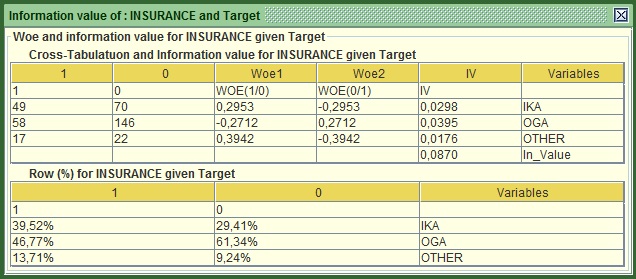
Image: IV of INSURANCE versus Target
The main statistics is at the bottom of the first table, here 0.087. The rule of thumb here is :
- IV<0.1 not very predictive
- 0.1<IV<0.3 quite predictive
- 0.3<IV<0.5 Very predictive
- IV>0.5 Jackpot!
Based on this classification Insurance does not appear very predictive individual but it might still be able to add value (e.g. to explain information that other variables are not able to). Something interesting in this table is that it shows the computed Woe (Weights of evidence) very commonly used in credit scoring. They are based on the odds of churners versus non-churners and are quite useful when you want to convert a string (categorical) variable into numeric. All you have to do is replace each distinct category with the respective woe. In this example you will have to replace all IKA values with 0.2953, all OGA with -0.2712 and so on. You do not need to worry more about this one.
The truth is you can check these statistics all day long if you do it one by one. A good way of seeing them all in one go is:
- Go to the Reports tab in the menu bar and press Binary Report
 .
. - On the left of the two columns, select TYPE then REGION, INSURANCE, SEASON, DISEASE, INSTITUTION or just type TYPE,REGION,INSURANCE,SEASON,DISEASE,INSTITUTION in the first text field
- From the right column select Target or type Target in the second text from the top.
- Press Confirm.
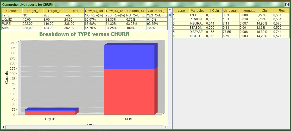
Image:Report of Multiple Variables versus Target
The left part of the screen shows for all variables individually their cross tab with the target (e.g. how many churners and non-churners exist in each category) along with the bar charts and the RoC curves as we saw them before. If the RoC curves appear to be the other way around (the red line is under the blue), do not worry about it, it is the same thing and the interpretation is symmetrically the same.
If we focus on the right side, we can see all the statistics that I mentioned earlier computed for each variable. In terms of predictiveness:
- The gold medal goes to DISEASE
- Silver to INSURANCE and
- Bronze to institution (that was a tough battle with the second).
Based on this classification TYPE should have never participated in this “Race”, it appears to be a total amateur!
Anyway, it appears that we got more familiar with our variables, especially with the categorical ones. In the next part we will start preparing them for modeling. You may now proceed to tutorial 3.